Put the Image to Work
Following a visual idea from the reference, through the work, and into the next version.

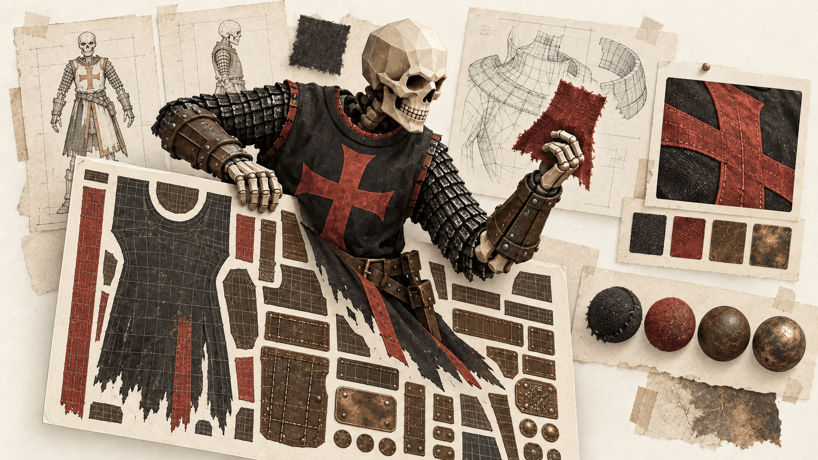
The choices in the reference
The skeleton warrior’s red trim looks worn before the character ever moves. It sits against dark cloth and weathered metal, with a collar that follows the shoulders. The small fittings belong to the same world. Those choices give the concept a particular weight—and taking that concept into Blender means deciding exactly how each of those details survives the build.
Put the render beside it and a few details pull in a different direction. The red is lighter and less saturated. The fittings catch the eye more readily. The collar flares outward, changing the outline around the shoulders. The character is recognizable, but the next pass has several questions to work through.
I built PIL Agent Plugin for this kind of work with coding agents such as Claude Code. It brings image measurements, comparisons, crops, and annotations into the review. I choose the direction; the agent runs the tools and works through the results with me. That is the “we” in the examples here.
The useful part is deciding what to change next. A lighter patch of cloth might send me toward its color, the material, or the light falling across it. A collar with a different outline asks something else of the build. They appear beside each other in the same render, so a review needs to give each detail enough attention to find a sensible next step.
I chose the collar, fittings, and inner cloth panel as places to start. The plugin marked those regions and pulled out a close-up, keeping the reference and the work in progress together.
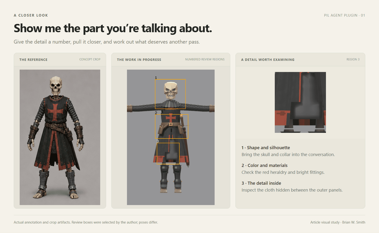
View the review comparison at full size
The concept and render use different poses. I’m looking at those selected details, with that difference in mind. The boxes give the conversation a reference point: we can discuss the collar without losing track of which part of its appearance we mean, and return to it after an edit.
Give the question a boundary
The red trim is a manageable place to begin. We sampled the prominent accent colors from the relevant areas and arranged them as swatches. The plugin also compares the palettes using a standard color-difference calculation. Here, the result gives us a more specific description of the change: the sampled render region is lighter and less saturated.
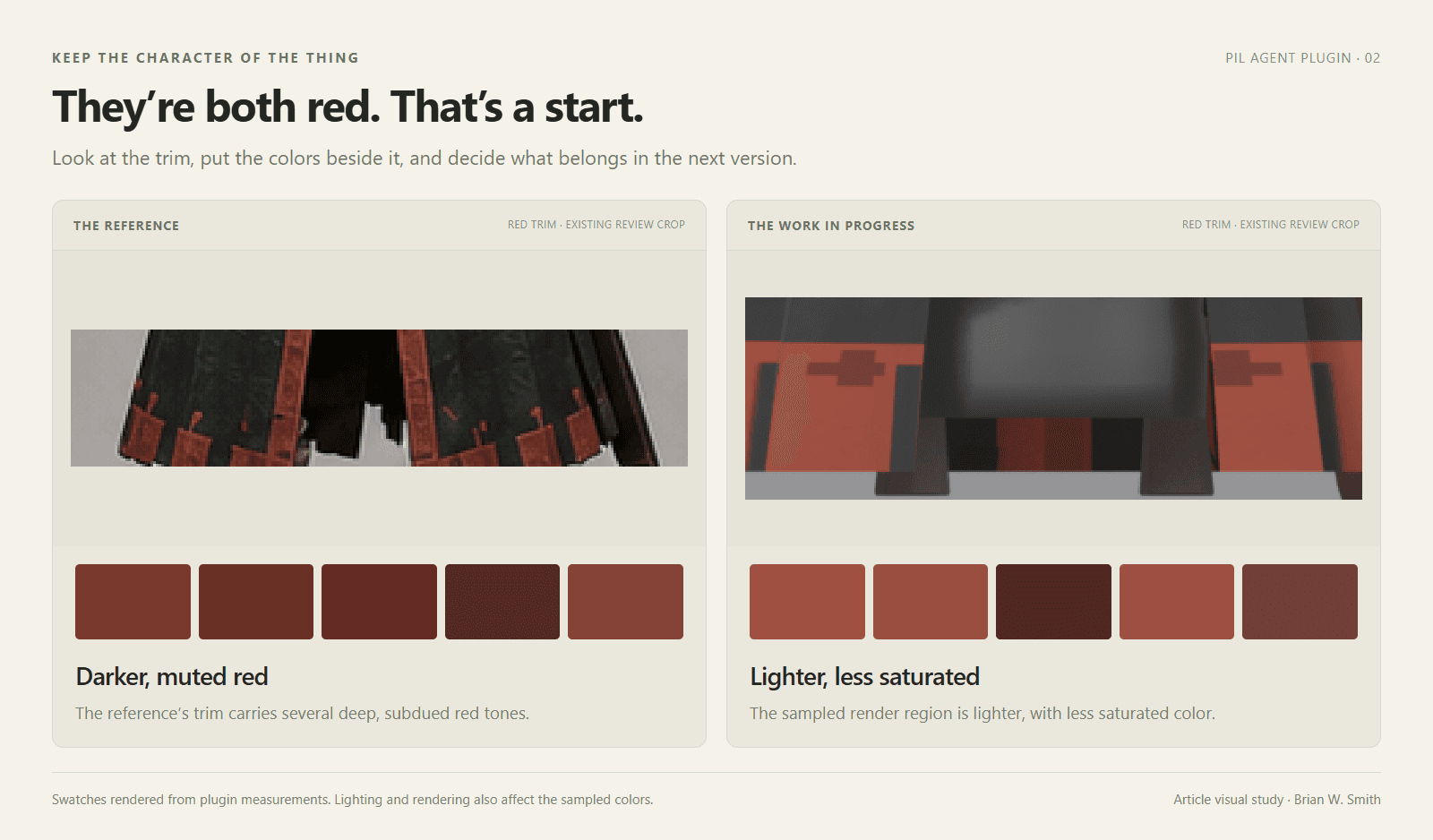
View the color comparison at full size
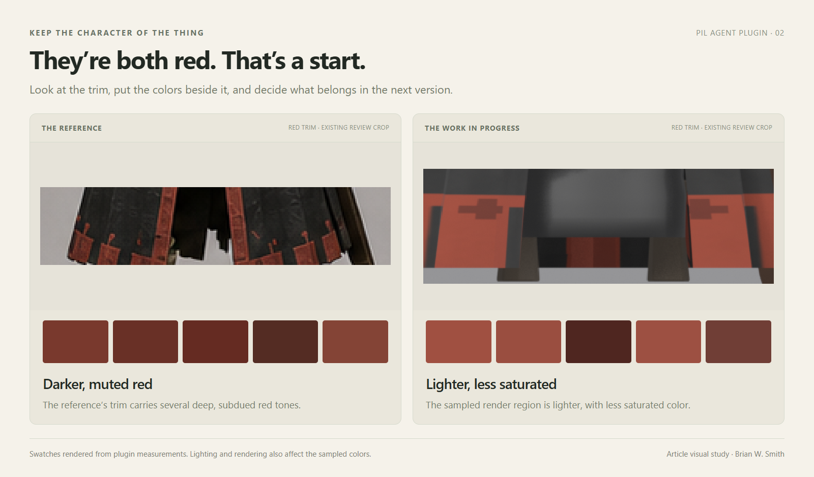
These crops are at different scales, and the comparison concerns their sampled colors. It leaves the shape of the garment for another question. Lighting and rendering also affect what appears in those pixels, so the swatches give me a place to investigate rather than a ready-made instruction to recolor the material.
Choosing that boundary became an important part of the plugin’s development. In an early experiment, an agent correctly identified the vivid accents in a mostly dark image. A palette weighted by pixel coverage filled up with dark tones and missed them. The colors occupying the most space had crowded out the small ones carrying meaning.
That led to separate views of the dominant colors, vivid accents, and individual color families. The question could determine which view to use. A narrow strip of red or a small bronze fitting should still be visible in the result when that detail is the thing we’re investigating.
A comparison of two different swords made the same issue hard to ignore. They shared a large preview background and received a full-image structural similarity score of 0.991. The background was doing most of the agreeing. Foreground comparison grew out of that failure, concentrating the measurement on the object. The project’s design rationale and foreground example record those decisions.
With the trim isolated, we can decide whether its current appearance belongs in the character. We might keep it, adjust it toward the reference, or try another version. The measurement gives that decision something concrete to rest on. The next render is where we find out what the edit actually did.
Follow the change
Once I’m ready to adjust the trim, I want to keep that edit contained. A character’s texture atlas can hold several materials in one image: cloth beside leather, a belt near its buckle, small fittings tucked into the remaining space. Changing the red is only part of the job. The neighboring pieces still need to belong to the character when the texture goes back onto the model.
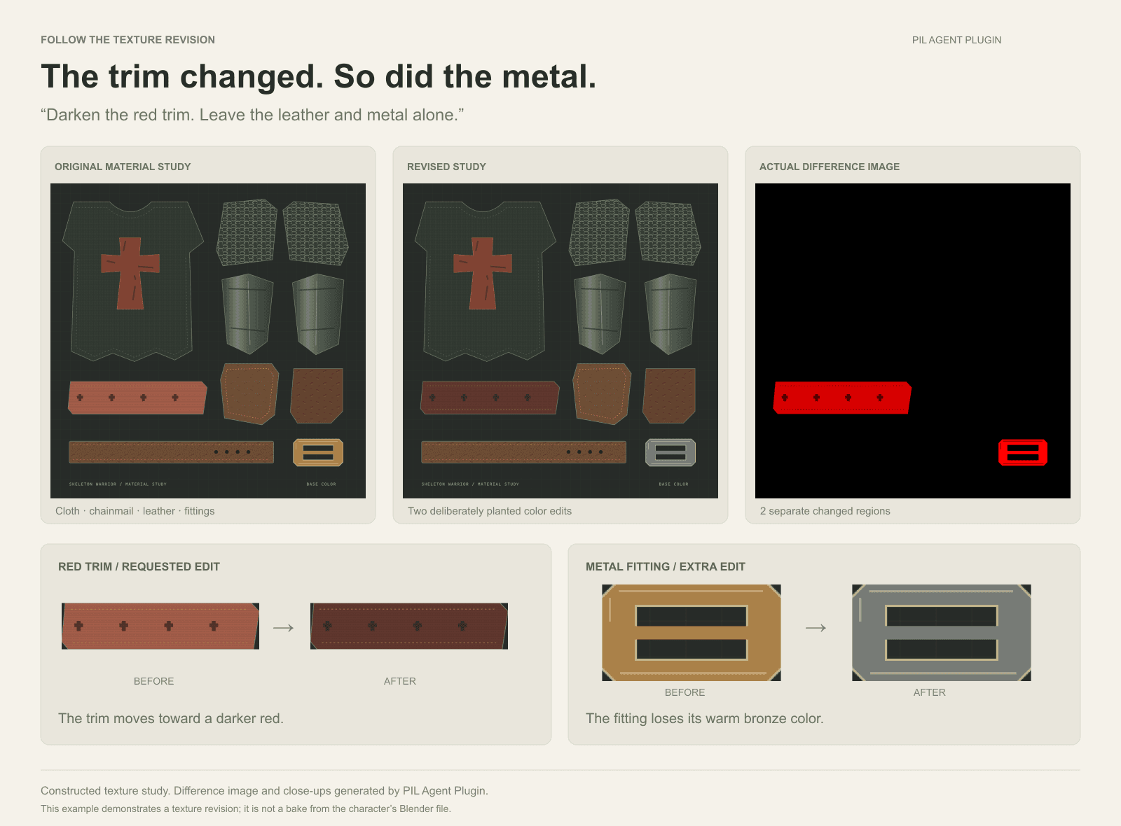
For this article, we made a simplified texture sheet in the warrior’s material palette. It is a constructed study for the comparison. I specified two deliberate changes: darken the red trim as requested, and remove some warmth from a bronze fitting elsewhere on the sheet. The brief to the agent was:
Darken the red trim. Leave the leather and metal alone.
The revised sheet gives the trim a deeper red. It also turns the bronze fitting gray. Most of the sheet is unchanged, and the trim is the large, obvious edit. The smaller fitting is easier to pass over while looking at the color we asked to change.
The plugin’s difference image picks out both regions and produces a close-up of each. Put the fitting’s before and after crops beside one another, and the second change is clear.
View the texture comparison at full size
The next prompt to the agent can be specific: keep the darker trim, restore the fitting’s bronze color, and compare the sheet again. The close-up can travel with the instruction, keeping attention on the part that needs another pass.
On an actual asset, I would then check what that region covers on the model. If several fittings use the same area of the atlas, an edit that looks small on the sheet can appear in several places on the character. An overly broad selection or a rebake that changes another region could leave the main revision looking right while altering details around it.
That is why I want to retain the original sheet and the comparison as the asset develops. They give the next pass a record of what changed, including the parts outside the immediate brief. The current development tools can reuse a selected area and compare recurring revisions against thresholds checked on labeled examples.
A clean texture comparison settles one part of the review. I still want to see the material on the character: how the red reads under its lighting, whether the fittings retain their warmth, and how the cloth sits beside the collar we marked earlier.
Back on the model
In a working asset pass, this is where I would load the revised texture onto the character and render the views again. The color edit can sit alongside the other unfinished decisions. The collar, for example, follows the shoulders and tucks beneath the cloth in the concept. In the build, it spreads outward into a wider form. Its outline still needs a decision of its own.
Once I’m working on how that collar sits around the shoulders, I want to turn the character and examine the shape from the side. I want to see where the parts meet, how much room there is between them, and whether an adjustment that looks right from the front creates another problem out of view.
Those questions take the review into Blender. The scene contains the meshes, materials, dimensions, and spatial relationships behind the render. The plugin’s scene tools can inspect those properties directly. For garment work, they can measure the space between clothing and the body, making fit and intersections part of the review alongside appearance.
The return to images matters just as much. After a scene edit, the rendering tools can produce a consistent set of front, side, and back views. We can examine the revised collar from those angles, then bring the color samples and close-ups back into the comparison. A new view can reveal a consequence the original picture never showed.
Keeping the views comparable lets me return to the question I started with. I can examine the collar’s revised outline at the same camera angle, then check the surrounding cloth and fittings. The edit may be small, but it still has to sit comfortably in the rest of the character.
I’m interested in making that continuity practical. Sometimes it takes one crop and a color sample. Sometimes it takes the scene, several views, and a record of the revisions. I want the work already done to remain useful when the next decision gets more involved.
If the muted red makes it into the character, it should be because we chose to keep it. If it changes, I want that to be a choice too.
Release status checked September 10, 2026: 0.8.0 is the latest published version, adding platform setup and readiness checks. This article also demonstrates local 0.9.0 development work, including the texture difference image, named selections, capture alignment, and comparison profiles. The character imagery comes from an earlier review. The simplified texture sheet and both edits were constructed for this article; they are not a bake from the character’s Blender file. The hero is generated editorial art. The comparison figures use actual tool outputs.